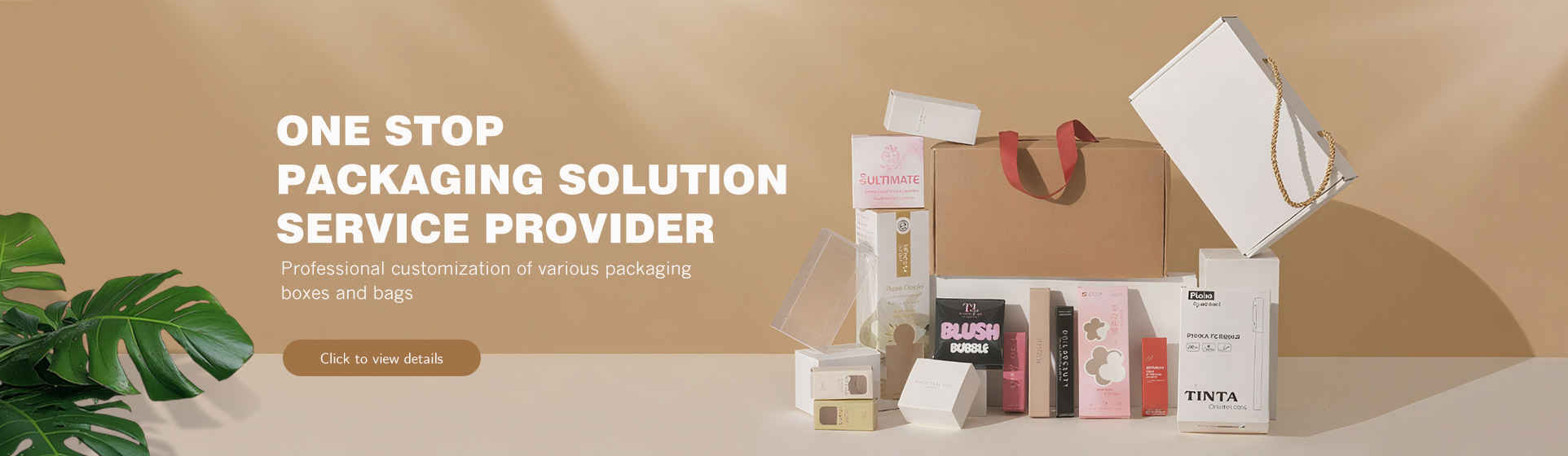
When consumers pause in front of a gift shop shelf or scroll through an e-commerce page, packaging is often their “first conversation” with a product. How critical is this first impression? Imagine two chocolate gift boxes for gifting: one is a plain glossy paper box, while the other has delicate patterns and a matte, textured feel—most people will reach for the latter first. This is the magic of visual communication: packaging acts as a “silent salesperson,” using texture, material, and visual details to guide perception, spark interest, and ultimately influence purchasing decisions. For the custom gift box industry, mastering this “visual + tactile” language is essential to standing out from competitors. More importantly, good packaging is not just a “container”; it can convey the brand’s warmth and tone through tactile associations and visual cues before the consumer even opens it.
1. The “Two-Way Dialogue” Between Vision and Touch: Beyond Just “Seeing” and “Feeling”
Every material has its own “personality”—the sturdiness of cardboard, the softness of velvet, the warmth of wood grain, and even the gloss of a coating—all trigger both visual and tactile experiences. These two types of experiences can be understood through real-world examples:
It is not a physical tactile sensation, but an illusion created through design, printing, or the inherent visual properties of the material. For instance:
✅ A “woven pattern” printed on the surface of a gift box, even if the box is actually made of paper, evokes associations of “handmade, natural”;
✅ A “marble pattern” created with UV printing inherently conveys a sense of “luxury and sophistication” visually;
Its core role is to set “psychological expectations” for consumers in advance and spark their curiosity about the product.
It is the real physical sensation when touching the packaging, which directly strengthens brand perception. For example:
✅ An embossed brand logo—when fingers glide over the raised edges, consumers perceive “attention to detail”;
✅ The roughness of linen-textured paper or the smoothness of soft-touch film instantly communicates a “vintage” or “affordable luxury” tone.
These two often work as “partners”: Take a gift box for “handmade soap”—the surface features a visual texture of flowing soap suds (evoking “gentle, moisturizing”), while the coating uses soft-touch film (feeling as smooth as the soap itself). The expectation consumers feel when seeing the texture is validated through touch, doubling their positive impression.
2. Sensory Design for Custom Gift Boxes: 3 Practical Scenarios
Integrating “visual + tactile” elements into actual design does not require complex processes; the key is to “accurately match the product’s tone.” Below are 3 practical scenarios commonly used by brands:
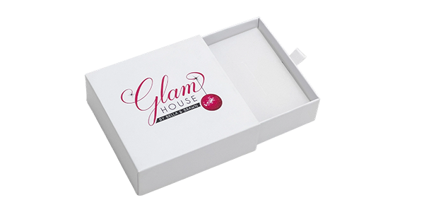
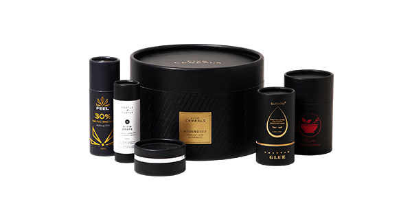
Scenario 1: Using Material Authenticity to Convey Core Values (Suitable for Brands Focused on “Natural, Luxury, or Vintage”)
Leverage the inherent texture of the material directly, with minimal modification—let the “material speak for itself.”
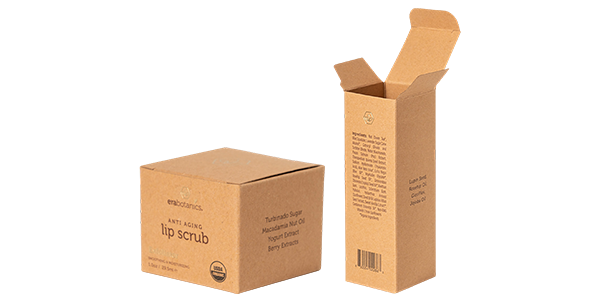
The advantage of this approach is its inherent “authenticity,” which easily fosters consumer trust in the brand as “sincere and not ostentatious.”
Scenario 2: Imitative Innovation: Let Packaging “Preview” Product Texture (Suitable for Products with Unique Tactile Qualities)
Use common materials to simulate the “texture of the product inside,” allowing consumers to “perceive” the product in advance through the packaging.
The key to this method is “accurate simulation”: Avoid disconnect between the visual design and the product (e.g., using soft-touch film to simulate softness for a gift box holding hard toys, which would mislead consumers).
Scenario 3: Using Visual Effects to Capture Attention from Afar (Suitable for Shelf Displays, Trade Shows, Etc.)
If the gift box needs to attract attention from a distance (e.g., supermarket shelves, trade show booths), use “pure visual texture” to create impact—even if there is no significant tactile difference.
3. Practical Tool: Comparison Table of 3 Sensory Design Methods
Many people struggle with “which method is more suitable.” Below is a comparison table covering cost, effectiveness, applicable scenarios, and consumer perception to help you make quick decisions:
| Design Method | Visual Texture Characteristics | Tactile Texture Characteristics | Cost Level | Suitable Brands/Product Types | Consumers’ Core Perception |
| Natural Materials | Authentic, unmodified (e.g., handwoven bamboo texture, kraft paper fibers) | Strong (inherent material feel, e.g., roughness of bamboo, softness of cotton-linen) | Medium-High | Eco-brands, high-end gifts, vintage products (tea, jewelry, stationery) | Natural, reliable, warm |
| Imitative Simulation | Accurately matches product (e.g., silk pattern, cookie crumb texture) | Medium (simulated via coating/embossing, e.g., soft-touch film, embossed texture) | Medium | FMCG gifts, apparel accessories, food (scarves, cookies, handmade soap) | Exquisite, thoughtful, associative |
| Visual Effects | Exaggerated, impactful (e.g., 3D UV relief patterns, gold foil texture) | Weak (mostly coating feel, little tactile difference) | Medium-Low | Mass-market gifts, children’s products, trade show/shelf displays (toys, holiday gift boxes) | Eye-catching, fun, memorable |
Real-World Case: A high-end chocolate brand conducted a test—for the same chocolate, they used two types of packaging: a “natural material box” (walnut wood box with wood grain texture) and a “visual effect box” (paper box printed with 3D chocolate molten texture, smooth to the touch). Results showed: 70% of orders for gifting to elders chose the walnut wood box (perceived as “luxury and thoughtful”); 65% of orders for gifting to friends chose the 3D texture box (perceived as “fun and visually appealing”). This proves: There is no “one-size-fits-all best method,” only “the method that best fits the scenario.”
Conclusion: The Key to Making Gift Boxes a “Brand Memory Point”
The core of visual communication is never “creating complex designs,” but “allowing consumers to quickly grasp the brand’s message through ‘seeing’ and ‘feeling’.” For example:
By integrating these sensory details into the planning of custom gift boxes, the box is no longer just a “container”—it becomes the “first intimate interaction” between the brand and consumers. It tells consumers: “I understand the feeling you want; this is the ‘right gift’ you’re looking for.”
If you’re struggling with custom gift box design—whether you want to convey a “sustainability” concept, create a “luxury feel,” or make your gift box stand out on shelves—feel free to contact us. We will help you encapsulate your “sensory story” into the box through material selection, texture design, and printing techniques, ensuring consumers remember your brand the moment they see or touch it.
As festivals approach, many brands look for suitable gi […]
Imagine this: You’ve just scored 3 winter coats on Blac […]
Choosing a suitable insert directly determines the prot […]
How are many packaging boxes made from ordinary materia […]
Related links:
About us Company News Industry Dynamics Cardboard box Corrugated box Cylindrical box Envelope Gift box Label Paper bag