
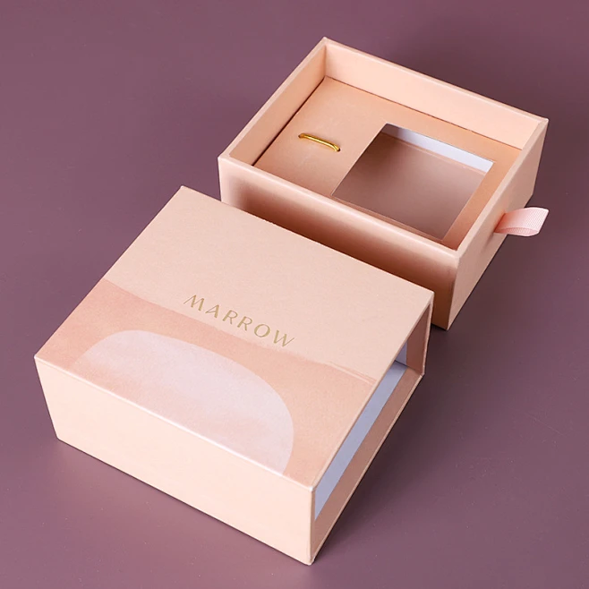
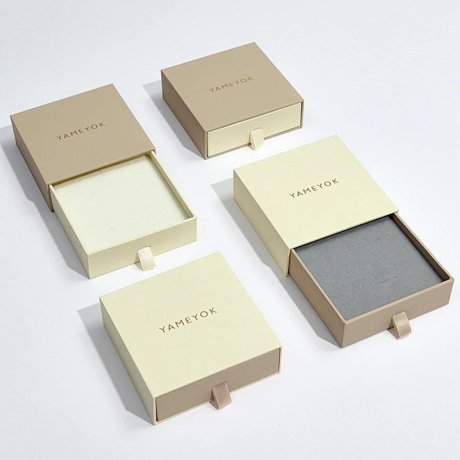
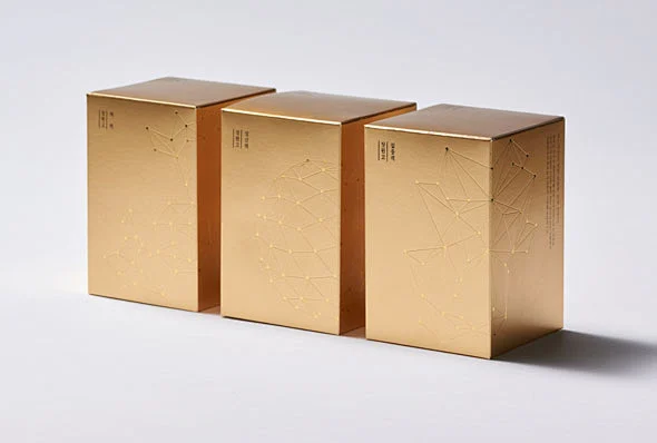
When it comes to custom gift boxes, choosing the right craftsmanship isn’t just a trivial matter of “looking good”—it’s the key to whether a brand can “tell its story” effectively! A decade ago, glossy gold foil stamping was the undisputed “face” of luxury packaging—its shine would catch the eye instantly, and everyone associated it with “elegance.” But in recent years, the tide has turned: matte gold craftsmanship has quietly “taken the lead” and become a favorite among many brands. What industry insights lie behind this shift, and what changes in public aesthetics does it reflect? Today, let’s talk about the “beauty code” of gift boxes and see how matte gold won people over with its true strengths.
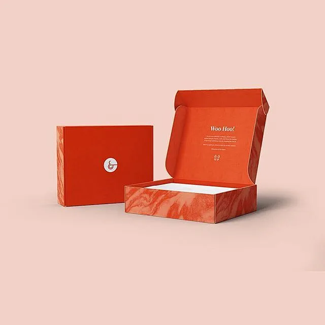
1. Material Upgrades: Specialty Paper Helps Matte Gold “Break Through”
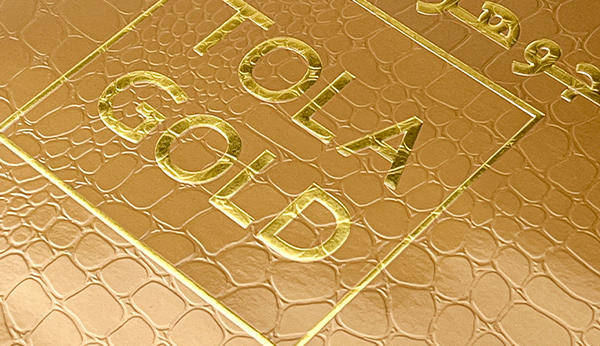
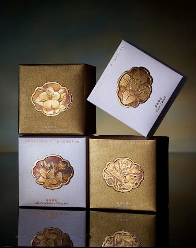
In the past, glossy gold really stood out on smooth paper, but now everyone prefers specialty paper and tactile paper—these papers have inherent textures and feel premium to the touch, but pairing them with glossy gold often leads to “disasters.” Take a high-end chocolate gift box, for example: using wood-grain specialty paper with glossy gold tends to look over-the-top, even giving off a cheap, knockoff vibe. But switch to matte gold, and it’s a whole different story—its muted luster complements textured paper perfectly, exuding understated luxury that hits right on the modern preference for “simplicity with depth.”
If you were a designer, would you see the combination of “natural textured specialty paper + glossy gold” as vintage charm or outdated tackiness? The answer actually lies in brand positioning—after all, matte gold has long become synonymous with “quiet sophistication”!
2. Craft Combinations: Matte Gold Is a “Versatile All-Rounder”
Modern gift boxes are no longer limited to “single-process” designs; they often use “combination techniques” like “foil stamping + embossing” or “foil stamping + lamination.” But this isn’t easy for glossy gold: after lamination, glossy gold tends to fade, creating a color gap from expectations, and even mass production struggles to ensure consistency. In contrast, matte gold has a soft, gentle tone by nature—whether paired with embossing or laminated, it maintains a stable texture, rarely creating the awkward gap between the “advertised look” and the “received look.”
Take a niche perfume brand that launched a new gift box last year, for example—they specifically requested both foil stamping and embossing. At first, they used glossy gold, but they kept running into problems: either the foil stamping and embossing were misaligned, or the glossy gold faded into “dull gold” after lamination, leading to a frustratingly low yield rate. When they switched to matte gold, not only did the two techniques “blend” seamlessly, but they also accidentally created a hazy, high-end texture. After launch, many customers said, “I wanted to buy it just for the box!”
3. Consumer Aesthetics: From “Ostentatious Luxury” to “Sincere Connection”
Back in the 2010s, glossy gold was popular because it didn’t need “partners”—it could stand alone to create a “luxurious feel.” But today, when people buy things, they value the “overall experience” more—packaging isn’t just a container; it needs to tell a brand’s story and convey emotion. The warm, gentle texture of matte gold perfectly aligns with this “understated luxury” aesthetic, making it a “secret weapon” for brands to stand out in competition.
Industry Data Comparison (Matte Gold vs. Glossy Gold Adoption Trends)
| Time Period | Glossy Gold Adoption Rate | Matte Gold Adoption Rate | Mainstream Combined Techniques |
| 2015-2020 | 75% | 25% | Single-process focus + basic composite techniques |
| 2021-2025 | 40% | 60% | Multi-process combination |
| 2022-2026 | 25% | 75% | Multi-process combination + material innovation (e.g., recycled paper) |
Conclusion: Great Packaging Is a “Two-Way Pursuit” of Aesthetics and Practicality
Custom gift boxes have never been about “the shinier, the better”—it’s about striking a balance between beauty and functionality. The popularity of matte gold isn’t just a craftsmanship upgrade; it’s a sign that consumers’ values are becoming more mature—instead of “being amazed at first glance,” people now prefer things that “grow on you the more you look.” For those of us in the industry, instead of chasing trends blindly, we should blend materials, craftsmanship, and consumer insights—only then can we create packaging that not only catches the eye but also stands the test of time.
Q&A Session
① Align with brand tone: Choose matte gold for understated luxury; go for glossy gold if you want limited-edition, eye-catching holiday designs.
② Match paper texture: Matte gold never misses with specialty paper or tactile paper; glossy gold works better with smooth paper or coated paper.
③ Consider craft combinations: If you’re combining embossing, lamination, or UV coating, matte gold is much more hassle-free; if you’re using single-process foil stamping and want to save costs, glossy gold is a better choice.
Since the start of 2026, many businesses have been comp […]
When businesses seek packaging solutions—whether for gi […]
The production of gift packaging boxes continues to evo […]
1.A Real-Life Story: The Hidden Cost of “Long Han […]