Selecting the right gift box is an art. It’s not just about simple containment; it’s a form of communication. A perfect gift box can enhance a product’s story, evoke the right emotions, and make the unboxing experience unforgettable. If you’ve ever wondered how to pick the right gift box for a specific product, you’ve come to the right place. Let’s step into the vibrant world of packaging psychology.
Before delving into product categories, let’s understand why color matters. Colors silently convey messages that our brains interpret instantly. They can stimulate appetite, convey trust, signal danger, or evoke a sense of luxury. Choosing the right color isn’t just an aesthetic decision; it’s a strategic one.
Imagine a beautifully wrapped box of chocolates. Now, picture it in a dull, gray box. Not very appealing, is it? For food products, the goal is to stimulate the appetite and convey freshness.
💡 Quick Quiz: What color gift box would you choose for a new line of organic lemonade? (Answer: Probably a bright yellow or zesty green to emphasize freshness and natural energy!)
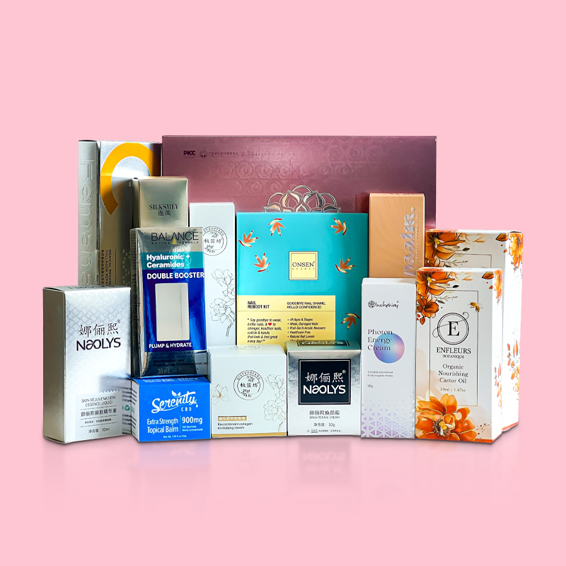
Cosmetics packaging is all about evoking a feeling, making it seem like a treat and an indulgence.
🌸 Scene Setup: Picture a luxury face cream. It arrives not in a loud, red box, but in a soft, matte peach-colored box with a satin ribbon. The experience feels luxurious and delicate even before the box is opened.
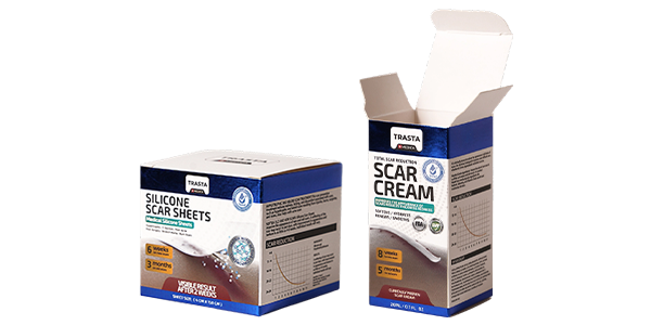
When it comes to medicine, packaging must be clear, trustworthy, and functional. Color coding is almost universal.
💊 Comparison Table:
| Color | Meaning | Applicable Products |
|---|---|---|
| Green | Peace, Anti-inflammatory | Painkillers, Anti-inflammatory Drugs |
| Red | Invigorating, Warning | Nutritional Supplements, Dangerous Drug Warnings |
| Black | Poisonous | Highly Toxic Drugs |
For textiles, the gift box should reflect the quality of the fabric inside. The focus is often on texture and contrast rather than loud colors.
🧵 Pro Tip: A tissue paper peek-a-boo window in a textile gift box can create anticipation and allow a touch of the fabric to be seen, enhancing the tactile experience.
Kids are drawn to brightness and fun! The packaging needs to be as lively as they are.
🧸 Thought Experiment: Why are most toy store aisles an explosion of color? Because it works! It captures attention and promises fun, exactly what a gift for a child should do.
A well-chosen gift box elevates your product from a simple item to a memorable experience. It shows care and attention to detail, ensuring your gift is never perceived as “too light” or unimportant. The right box does the talking before the product is even revealed.
At Shengcai Paper Packaging, we are more than just a gift box manufacturer. We are your strategic packaging partners. We understand these color psychologies and market trends intimately. We work with you to develop refined, custom packaging solutions that tell your brand’s story, connect with your customers emotionally, and make your products fly off the shelves—and look stunning while doing it.
Ready to create a gift box that truly wows? Contact us today for a consultation, and let’s build a packaging solution that adds immense value to your incredible products.
1. A Mall Question: Why Are Gift Box Colors Softer Than […]
Looking to make a lasting impression with your packagin […]
Let’s be real—every business doing custom paper gift bo […]
Tote bags are no longer just tools for “carrying […]
Related links:
About us Company News Industry Dynamics Cardboard box Corrugated box Cylindrical box Envelope Gift box Label Paper bag